PRISM Bags:
Bags made with purpose
company
PRISM is a brand focused on creating bags that are 100% sustainably made and environmentally friendly, use ethical labor practices, and give back to women's intitatives.
role
As a product designer, I was responsible for conducting research, developing a strategy, design and branding and next steps.
timeframe
3 week design sprint.
intro
Cutting the fat to make PRISM gleam
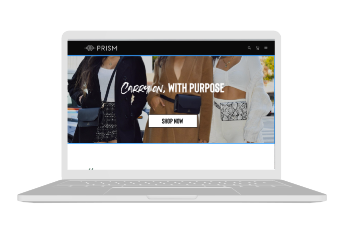
PRISM bags is a newly launched brand founded by two sisters on a mission. As activists who spearheaded the effort to repeal the "Pink Tax" in California, they built PRISM to reflect the change they wanted to see in the world: to empower women by giving back, to responsibly produce bags in an environmentally friendly way, all while maintaining ethical labor practices.
PRISM wants to set themselves apart from "fast fashion" brands but their mission was being lost with complicated navigation, dense text copy and slow loading times.
PRISM needed a way to show their brand values, while ultimately getting people to convert and buy a bag.
company
Highlight ethics to add value, solve the problem
During our initial client kickoff meeting we learned a lot about PRISM's friction points, goals and desires for the future.
Our clients expressed the need for simplified navigation, expressed a frustration with long loading times on their site and high customer cart abandonment. Our clients were able to help us understand who their target user was and give a lot of information about PRISM's goals and mission.
Strengths
PRISM has a strong sense of who they are as a brand and what they want to put out into the world. Their business ethics and thoughtfulness in product production and design is evident.
Weaknesses
PRISM is newly launched brand. They don't have an established following and aren't presenting their brand in the voice they need to play up the value proposition of the brand.
Opportunities
Helping users immediate recognize the brand values will increase the likelyhood of users feeling good about the purchase and convert them into brand ambassadors.
Threats
There is a lot of competition in the fashion market. Unengaging content might cause users to bounce.
competitive analysis
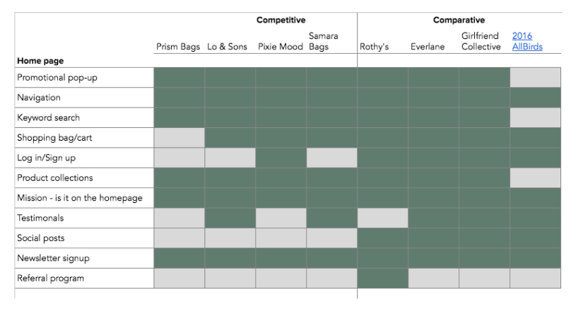
Understanding the competitors of public transportation would help us see what features travelers have come to expect and give insight to other creative solutions and how we may be able to implement well executed features in into our potential solution. We looked into other bag companies as well as companies focused on sustainability.

feature prioritization
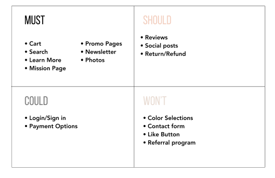
To synthesize the data we found during the C&C analysis, we utilized the MSCW method: must, should, could, won’t. This helped us decide which features to absolutely include in our design and which to save for a later time.
strategy
PRISM target user: Get it Gurl
While PRISM Bags already had a deep understanding of their target audience, it was important for us to hear from their demographic about their needs, wants, and dislikes about shopping as a whole. In addition to understanding their purchasing habits, we asked our users to complete a task analysis—purchasing a bag, learning about PRISM Bags' mission and overall feelings towards this brand at first glance. This helped us define our user persona, scenario, and the user flow and keeping her in mind every step of the way.
A few of the comments from our user interviews included:
“Anyone can just claim that they’re ethical. I think this is a brand I can trust but I’d have to read more about them.' -user
“I’d click through to the mission page *IF* I was already a fan of the brand.” -user
persona:
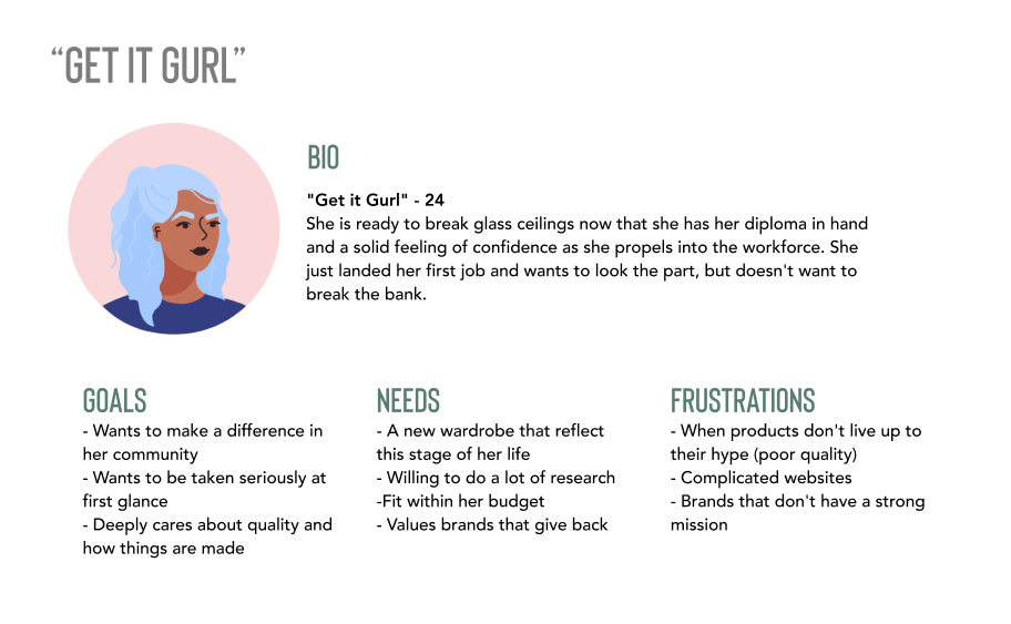
User persona: our user interviews confirmed who our target audience was, what she cares about and her painpoints. Based on this feedback, we created a user persona and called her the “Get it Gurl”.
To make it come to life, we created a real life scenario that ties her to your business goals to create a user scenario:
"Get it Gurl" has been looking for an every day bag for all of her quarantine essentials. She's been researching for a long time, and while she's found some nice looking bags, the brands don't check the ethical AND sustainability box. Her roommate and fellow women's right activist tells her about PRISM Bags—she's seen a few social ads—and decides to check them out.
affinity mapping
Using data from our user interviews and task analysis, we categorized the information to identify the major themes in the words of the customer and match it to PRISM Bags' goals.
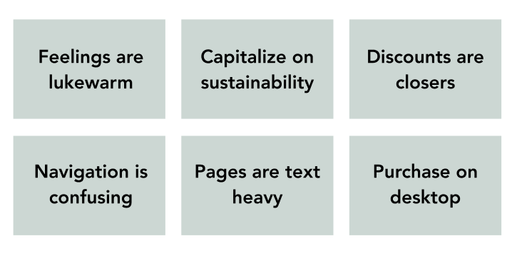
The affinity mapping exercise helped us synthesize all the data we received from our user interviews and task analysis. In doing this, it helped us understand the general themes around user expectations and how we can turn it into actionable features on the new website. There were several common themes:
Going from "Meh" to Marvelous:
Finding: User's initial reaction to webpage was lukewarm, said they couldn't differentiate product from competitors.
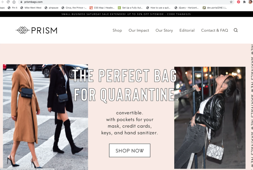
Finding: Users want to see a clear value proposition quickly when seeing a new product. There was too much text.
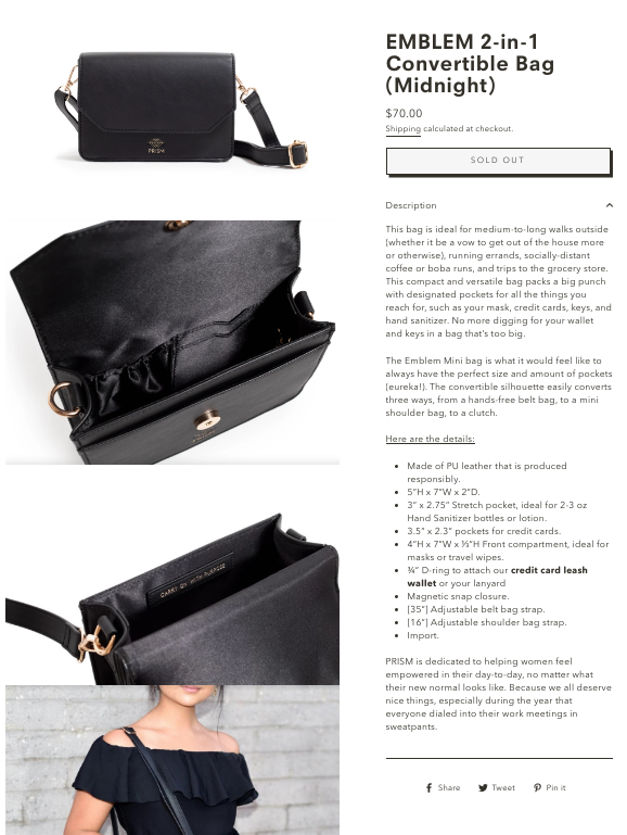
Capitalizing on sustainable values and ethical sourcing
Finding: Users are compelled by brands with a greater societal mission.
Finding: Sustainability is highly desired
Finding: Majority of users found the bag appealing when they gave it a close look.
Correcting accessability issues :
Finding: White on pink was hard to read

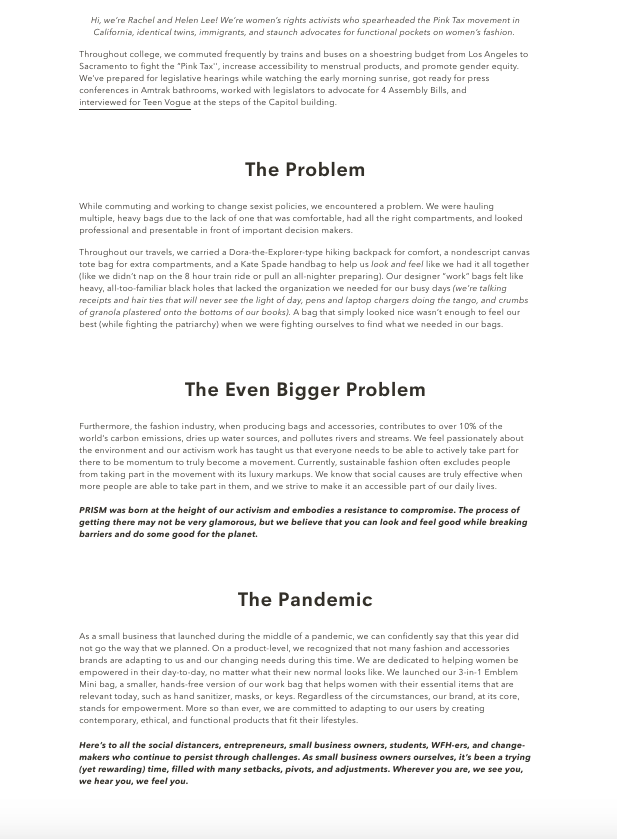
Finding: Enjoyed all the information under "Our Impact" but found there to be too text heavy.
Clarifying navigation:
Finding: Confused by what "Editorial" means in the navigation, thought it was press mentions.

Finding: Enjoys "Our Impact" "Our Story" but gets lost navigating between the pages.
Finding: Cart function appearing at the bottom is confusing and doesn't always show up.
Return policy is important, massage the heck out of that copy:
Finding: Return/refund policy is something that people look at before shopping for a product. Had to use "find" function to weed through information
Discounts are a closer:
Finding: Price and discounts are important. Users are price conscious and do not have a huge amount of expendable income and want something that will last.
Device used to purchase, to user buying habits:
Finding: Most users shop desktop.
Finding: Outdated discount code lead to cart abandonment
Suggestion: Clear, highly visible product photography; image should feel as "revolutionary" as the product.

Suggestion: Inform user of the bag's utility & quality while referencing the low price point. Condense product description into seductive copy to pair with imagery on home page.
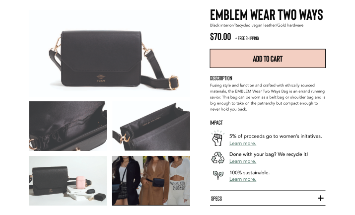
Suggestion: create a gentle yet compelling CTA incorporating strong imagery to invite users to learn about the brand mission and founder story.
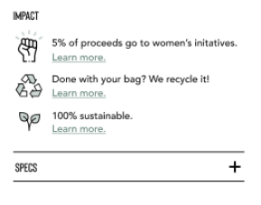
Suggestion: Leverage this verbiage throughout the site.
Suggestion: Capitalize on the quality of design and materials with equally high quality images and copy.
Suggestion: Stay true to branding colors, but update for better readability.
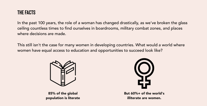
Suggestion: Condense information for more quickly digestible pieces and adding visual elements to be able to scan; add learn more button to go to other pages with more information.
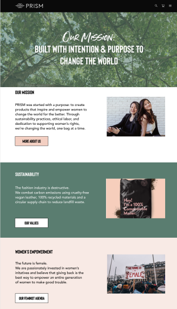
Suggestion: Make the menu simplier.

Suggestion: Condense into easier to digest section of content. Clearly defined by genre.

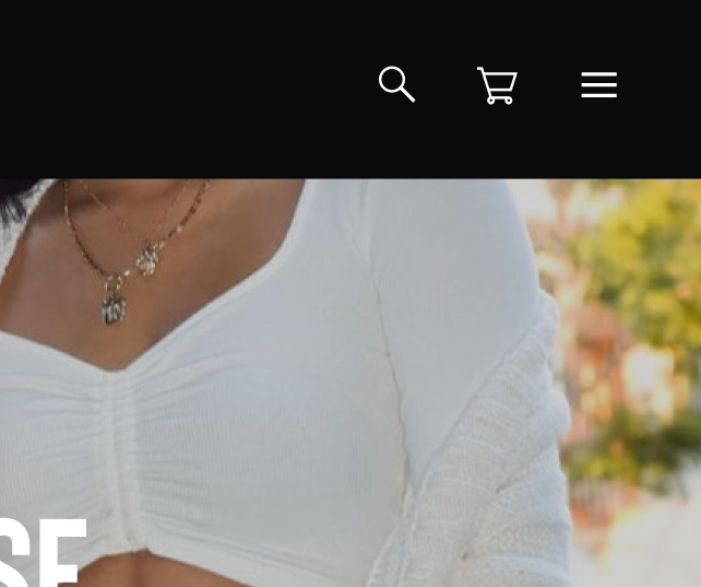
Suggestion: Follow best practices and add "cart" feature at the upper right.
Suggestion: Outline clear return policy and process.
Suggestion: Add durability information, build value in the brand and add a rewards program discount.

Suggestion: UX Team to build out desktop prototype
Suggestion: Remove old information.
mvp
We completed a MSCW Analysis to properly prioritize features for our target users. Given the time constraints and budget, it is not feasible to build, design and test a fully robust prototype. Completing a MSCW allows our team to determine what the most important features are for the MVP (Minimal Viable Product) so we can ensure our final product is a working and functional representation of the website.
Our MVP:
Based on this list, we determined our Minimum Viable Product (MVP):
- Redesigned home page
- Redesigned shop and product pages
- New hamburger menu navigation
- New mission page with topic sub-navigation
- Develop brand voice and messaging through site design
discover
Wireframes paired down the noise
brainstorm & sketch
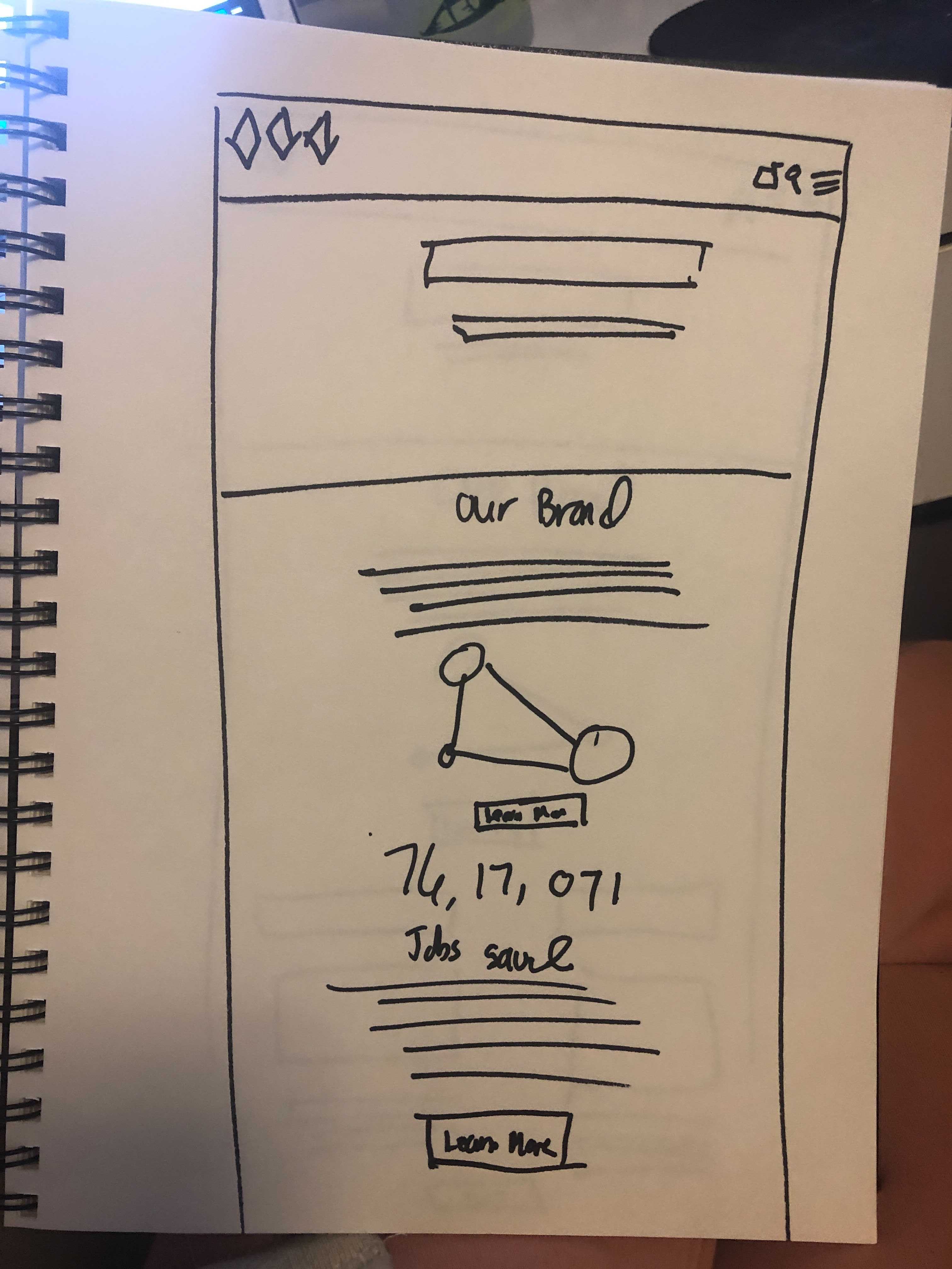
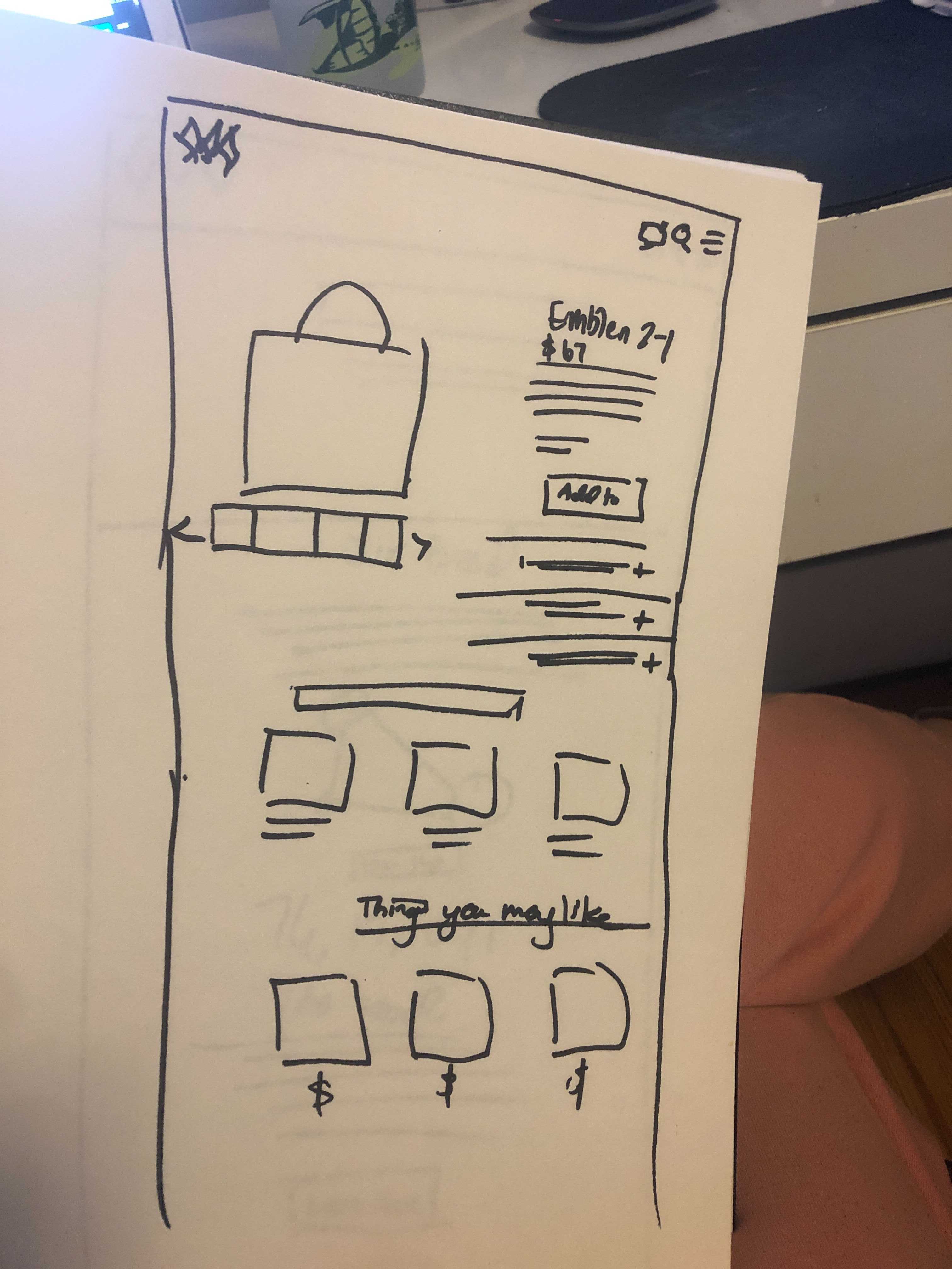
I compiled and conduced simple sketches, layout, features and ideas and how we could best highlight the PRISM brand and help increase engagement and convert more customers in to brand ambassadors.
We kept the MVP in mind as we chose how to add functionality and delight for customers as they moved through their purchasing experiences. With the site using a Shopify theme, we did not choose to work through the checkout part of the workflow, but rather, highlight the brand and value of the product. We also considered next steps and possible barriers on implementation of the site.
wireframes
We compiled semi-low fidelity wireframes to propose product features and design changes based on the user scenario and user tasks. The wireframes were able to assess what worked and what didn’t work in terms of components, colors and porportions.
Lessons Learned
Ask more questions in user interviews. And ask WHY WHY WHY WHY WHY
Our client knew their customer through and through, supported by data and validated in our user interviews. In talking with our users, we didn’t ask “why” enough to get into the depths as to why customers abandon their carts. In retrospect, that insight could have led us to design a different checkout experience or adding features to the cart, ensuring that they moved through checkout.
Establishing Expectations & Boundaries
We had established clear communication channels with our client via Slack, bi-weekly meetings, and shared agendas. We handed over a mid-fidelity prototype for them to respond to without walking them through notating our latest revisions. At the time, we thought that we had shared so much that it was obvious, but they came back with a flood of changes and referencing old mockups. It left us with more work to make changes that they wanted, while also defending our design decisions. All of that frustration and time could have been avoided if we took time to walk them through the first time.
In the end the client LOVED our designs and ending up hiring a developer to implement our suggestions.
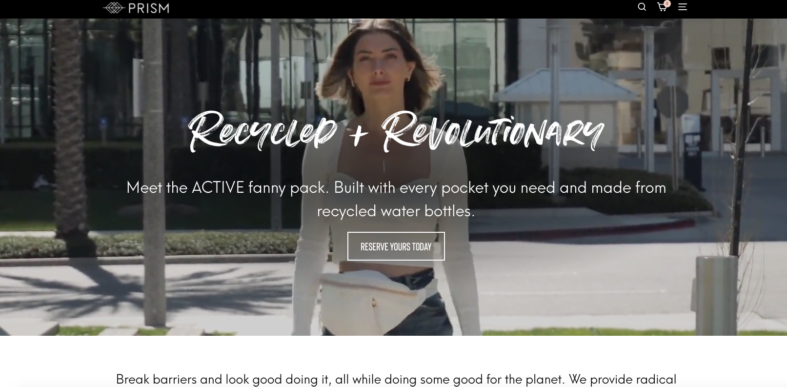
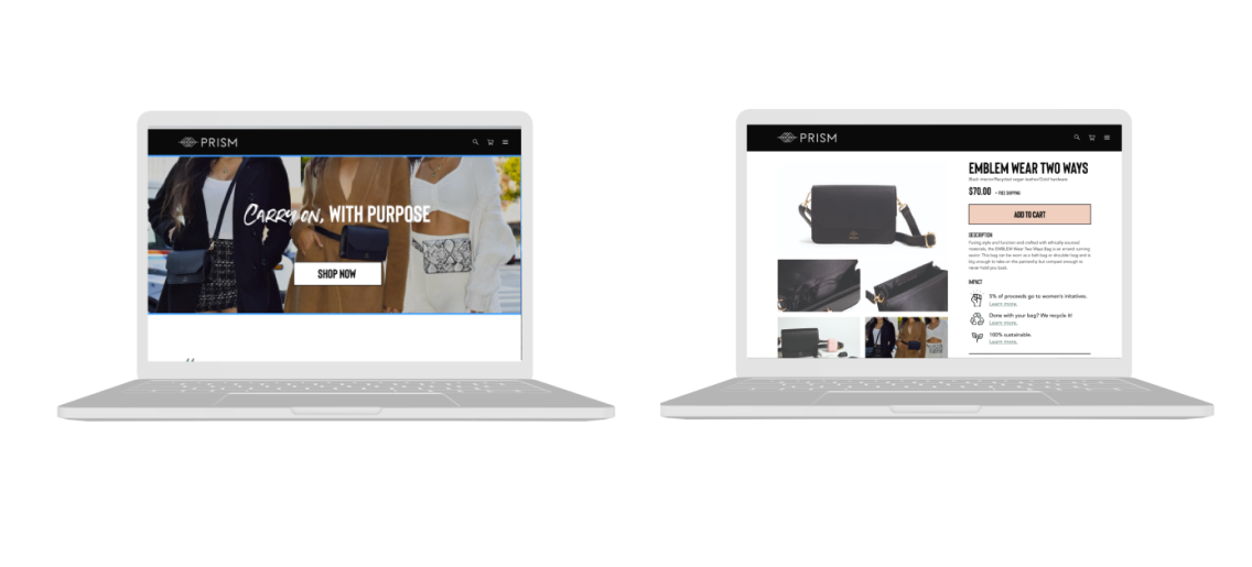
See the new PRISM website here
Selected Works

