ORCA Card:
A love story about mobile ticketing for public transit
company
ORCA Card wants to reduce the number of cars on the roads and become more environmentally friendly by getting more people to use Seattle public transit for their daily commute.
role
As a product designer, I was responsible for conducting research, developing a strategy, design and branding
timeframe
2 week design sprint
UX Methods
• Interviews
• Competitive & Comparative Analysis
• Feature Prioritizations
• Affinity Mapping,
• Insight Statements
• "How Might We” Statements
• User Flows
• Sketching
• Wireframing
• Prototyping
• Usability Testing
intro
What did we get ourselves into?
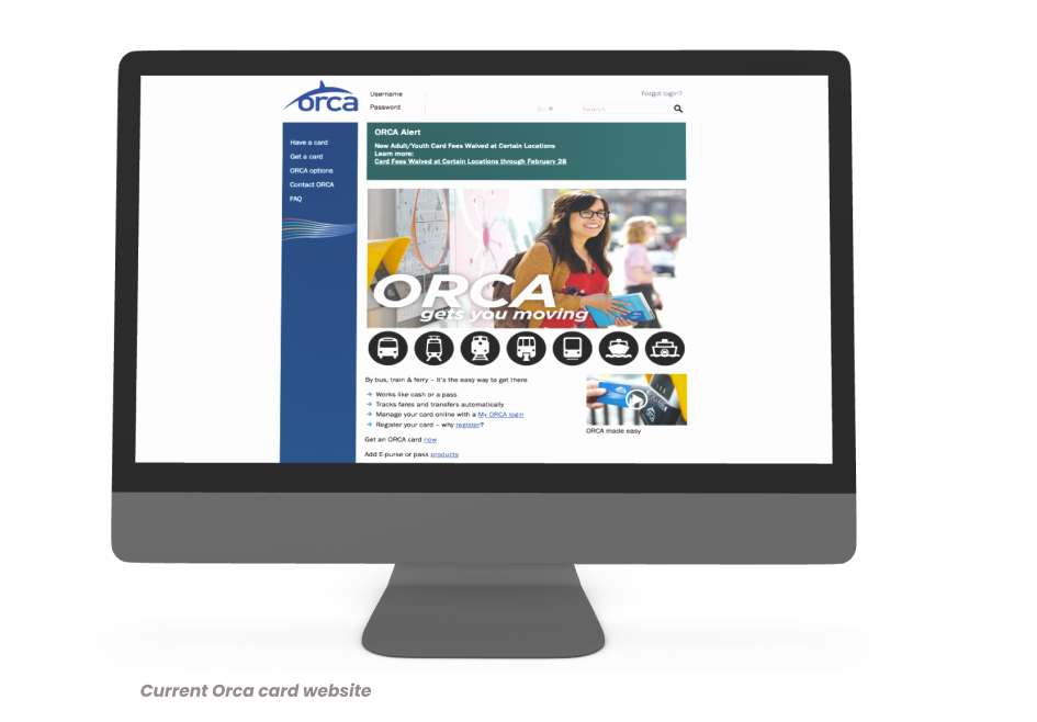
The ORCA card is the preferred method that public transportation users in Seattle use to pay for their bus, train and ferry fares. Over 87% of travelers use their ORCA card to pay fares. However, only a fraction of those people use the Orca website to digitally reload the card, instead using kiosks on location.
Seattleites love using their ORCA card but are wasting time reloading their cards at kiosks and funds added via the ORCA site are not available for 48 hours.
company
Problems, but there's hope!
In phase 1 of our research we first needed some context for why the ORCA card website needed to be improved. We needed to understand a few core things about Seattle and the ORCA system itself.
During our research we discovered Seattle ranks 9th in public transportation nationally which provides a solid foundation to potentially convert more drivers to be daily public transportation users. The goal being to reduce the number of cars on the roads and become more environmentally friendly by getting more people to use public transit for their daily commute.
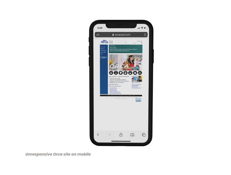
The problem we recognized is that the website currently isn’t meeting the needs of travelers. It is outdated, not responsive on mobile with confusing navigation and funds reloaded digitally through this site are not available for 48 hours.

Strengths
People love their ORCA card and it's their preferred method of payment.

Weaknesses
The website is outdated and funds are not available once loaded for 48 hours. Navigation is clunky and the site is not mobile responsive.

Opportunities
Making paying for fares as simple increases the satification rate and likelyhood that ORCA card users will continue to like, enjoy and recommend public transporation to alternative types of travel methods and saves travelers time; the most precious resource.

Threats
If travelers have a negative experience with public transportation they may stop using it and choose an alternate method.
The revolutionary proposed solution
By creating an automated, digital card that bypasses the need to reload funds, and by giving riders the ability to view their account and ticket status, Seattle commuters will have peace of mind. Card users will be able to have:
- visibility into their account
- instantly available funds to pay the fare
- a fast, easy way to tap in
With a digital ticket, there will be an ORCA card in the hands of every Seattleite with a smartphone.
Diving into the research
competitive analysis
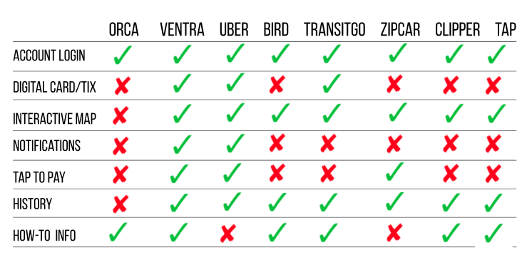
Understanding the competitors of public transportation would help us see what features travelers have come to expect and give insight to other creative solutions and how we may be able to implement well executed features in into our potential solution. We compared ORCA to Uber, Ventra (the Chicago transit app) and Clipper (the San Francisco transit app).

feature prioritization
To synthesize the data we found during the C&C analysis, we utilized the MSCW method: must, should, could, won’t. This helped us decide which features to absolutely include in our design and which to save for a later time.
strategy
Fascinating findings about ORCA users
user feedback
We utilized user interviews to allow for open-ended discussion about the current ORCA (or Clipper) system. We also scoured Reddit to get insight into what current users were sharing about their ORCA card traveling experience. We did this to understand user pain-points so we could create better opportunities for a happy path. A total of 7 users were extensively interviewed about their experiences.
A few of the comments from our user interviews included:
“I don't like not knowing my balance and online reloading is a pain because of the very outdated website. I don't like using it.”
- Chelsea
“Sometimes if there's a long line and I can't quickly add funds to my card, I’m missing my train. I wish I didn’t have to keep adding money.”
- Conrad

affinity mapping
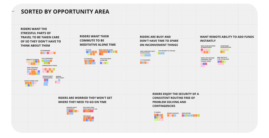
Affinity mapping was used to detect themes within our user interviews. With those insights, we could form statements about our users and hypothesize how we may solve their problems.
In order to make sense of all of our user interviews, we utilized affinity mapping to group similar data points pulled from the interviews. We discovered that our users were:
- On-the-go young professionals
- Tech-savvy
- Want to be left alone while commuting
- Busy
concept pivot and solution
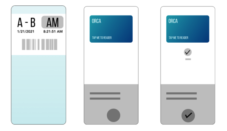
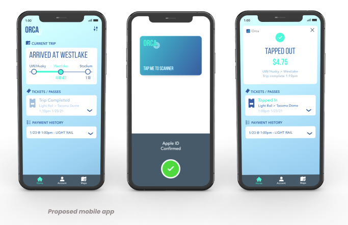
During the research process, we discovered that the current ORCA site was too outdated to attempt a redesign. Our solution was to invent a mobile replacement to the physical ORCA card that links the account to a payment source providing instant funds and gives a way to view payment and trip status to reduce worry when traveling, thus, reducing the need to reload the card at kiosks at all.
user flow
Based on the extensive affinity mapping, we crafted our hypothesis on how to solve our users problems, we discovered four key tasks someone would go through to use our solution:
1. Connect ORCA virtual card to mobile wallet
2. Pay your transit fare
3. Check to confirm, payment and correct route
4. Check ETA to arrival
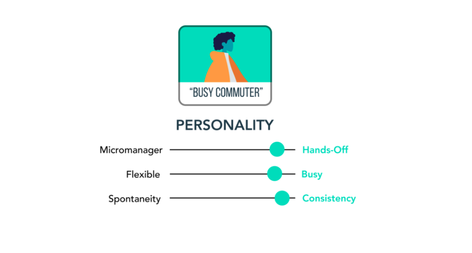
persona
After thoroughly identifying users needs, we were able to pinpoint an ideal persona and the pain points they may encounter while using public transportation and their Orca card.
The person we arrived at we called: Busy Commuter.
- Long-time Seattle resident
- Uses bus and Lightrail
- 30 minute commute
- Don't bother me!
- Wants routine
user scenario
The Busy Commuter is rushing to board their train to get to work on time. In order to pay their fare they have to load money onto their ORCA card, but there’s a long line at the kiosk and the website doesn’t work on their phone.
discover
Exploring creative solutions, organizing & executing
brainstorm & sketch
I compiled and conduced simple sketches, layout, features and ideas with my team based on user research conducted. The ideas were proposed and evaluated by the team and determined different creative solutions, the approach of how to design the user interface, flow and experiences.
Brainstorming sessions often took places for several hours at a time discussing new features, problems, friction points and solutions on how to improve the Orca card experience. We also considered next steps and possible barriers on implementation of the app.
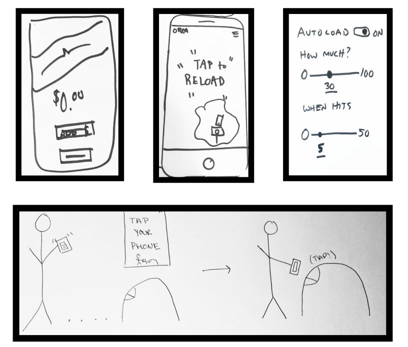
wireframes
Based on our concept pivot to a mobile ticketing system, semi-low fidelity wireframes to propose product features and design changes based on the user scenario and user tasks. The wireframes were able to assess what worked and what didn’t work in terms of components, colors and porportions.
prototype
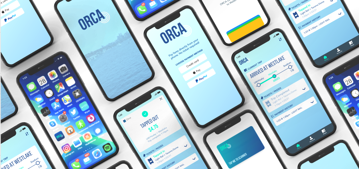
Based on the initial semi-low fidelity wireframe and iteration process we further developed higher fidelity prototype showcasing the the newly redesigned ORCA card mobile app.
Design considerations:
Calming color scheme
Readable typeface
Another design consideration was to redesign the ORCA logo to include “sonar” waves, which were indicative of how the mobile app would actually function using the phone’s near field communication technology.
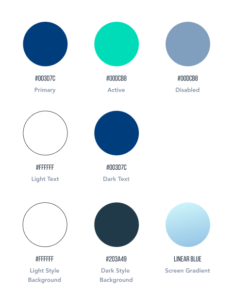
The app itself has minimal, clean design, in a eacy to read format. Accessability concerns were taken into consideration for the visually impaired so sound and vibration notifications would also be implemented into a final design of this prototype.
We did a series of user tests to observe how users would interact with the mobile ORCA app and see if any obstacles arose and their general experience they had with the app so any changes could be implemented. We discovered that the mobile app solved many of the friction points that the user was experiencing.
Introducing the new mobile ORCA app for a delightful public transportation user experience
prototype
Next Steps
Some of our next steps and considerations for the next iteration of the app.
- API integration for other transportation apps like OneBusAway or incorporate this technology into the app
- Account Profile (student, senior, child, etc.)
- Add a secondary/backup payment method suggestion in the payment adding process
- Database for customer data, invoices, behaviors
- Integration with social media for discounts and/or promotions
- Report a problem
- Marketing campaign around rollout for visability of new product introduction
- App/mode designed for non-english speakers
- Anti-virus/hacking prevention
- First time user? Start here for a tour
- Integration with paratransit for differently abled individuals
- Notification settings
- Seat-saver functionality for wheelchair seats since for limited wheelchair spots on transit
Selected Works
